 Dali Marketers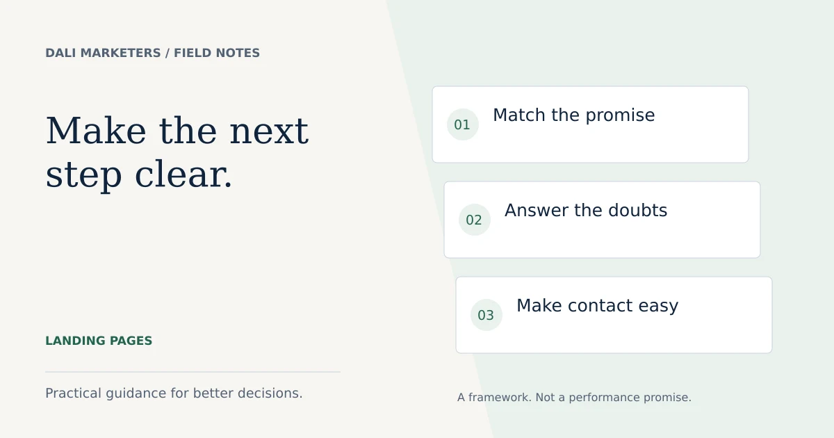
The quick answer
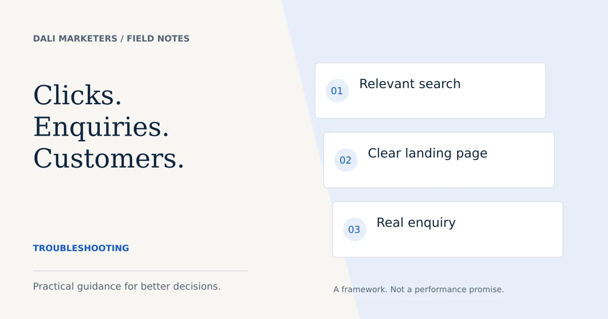
A strong landing page continues the promise in the ad, answers the buyer’s immediate questions and provides a clear, working next step.
Check the promise from search to page
A Google Ads landing page should make the visitor feel they reached the right place. Read the search intent, ad and opening section together. Are they describing the same service, location and next step?
If your ad promotes a specific audit, sending people to a page listing every marketing service introduces extra work. A focused destination can explain what the audit covers and who it is for. That does not mean every keyword needs a separate page; related searches can share a useful destination when their needs align.
Before changing colours or button shapes, write the one question the page should answer for a new visitor.
Make the first screen useful
The opening section needs a clear service description, a concise benefit and a visible action. Visitors should not have to decode a clever slogan to work out what you sell.
Use one main action such as requesting a quote or booking a consultation. A secondary link to pricing can help visitors who need more context. Explain whether the initial conversation is free, what the paid service includes and what happens after the click.
Avoid presenting unverified statistics as proof. A real sample of the deliverable is often more helpful than a decorative dashboard of impressive numbers.
Add evidence that answers a real doubt
Think about the buyer’s uncertainty. Do they need to see the quality of the work, understand the process or know who will handle the account? Choose evidence that addresses that specific concern.
Useful options include a redacted report excerpt, a documented project, an accurate service scope or a real testimonial shared with permission. Label illustrative examples clearly. Stock portraits should not imply they depict your customers or team.
Explain your role without inventing credentials. A short, honest introduction can make a service page feel more accountable.
Make contact easy on a phone
Test the page at a narrow screen width. The heading, offer and action should fit comfortably without horizontal scrolling. Buttons need enough space around them, and form fields need readable labels.
For phone and WhatsApp routes, confirm the number and prefilled message. For forms, verify delivery to the inbox and show a truthful success message only after submission succeeds. Never tell someone their enquiry was received merely because they opened a messaging link.
Use appropriately sized local images, reserve their display dimensions and avoid hiding essential content behind elaborate animations.
Review the complete decision journey
| Area | Visitor’s question |
|---|---|
| Offer | Is this the service I need? |
| Scope | What is included and excluded? |
| Evidence | Why should I trust this provider? |
| Price | What will I pay, or how is it quoted? |
| Contact | What happens when I get in touch? |
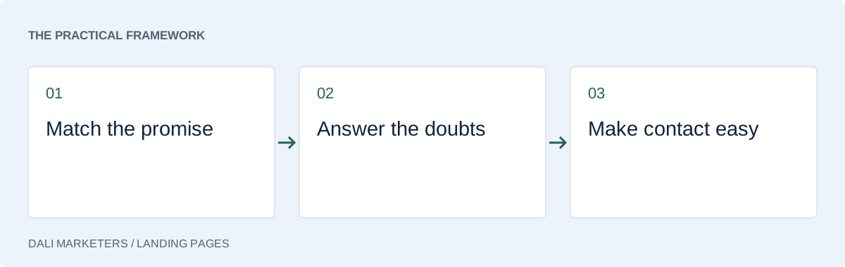
Use this table to remove repetition. If three sections repeat a general promise but none explains the deliverable, replace them with a concrete explanation. The page can be substantial without making the same argument several times.
Measure the right action
A higher button-click rate is not necessarily an improvement in enquiries. If you change the contact route, compare the quality and number of completed enquiries as well as the interface metric.
Test conversion tracking after changing the page. A new form or confirmation message can break an existing event even when the page looks correct.
Write down a hypothesis before a test. For example: “Showing the minimum project scope will reduce unsuitable requests while preserving qualified enquiries.” Decide how you will evaluate it and avoid drawing conclusions from tiny samples.
Choose the next improvement from evidence
Start with functional faults and unclear information. Once the page works and the offer is understandable, investigate finer changes such as headline wording or the amount of detail before the call to action.
If relevant visitors rarely enquire, review the page alongside the actual searches that brought them. If enquiries are plentiful but unsuitable, use the lead quality guide. These are different problems and may need different changes.
Our Google Ads lead generation service can combine campaign setup with a page designed around your enquiry process. The aim is a coherent journey from the search to the conversation.
Sources & further reading
Platform details checked against these Google resources on 23 September 2026. Examples and diagnostic frameworks are explanatory; account results will vary.